ShopDreamUp AI ArtDreamUp

Deviation Actions


Suggested Deviants


Suggested Collections


You Might Like…


Featured in Groups

Comments160
Join the community to add your comment. Already a deviant? Log In
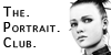
The first thought or feeling I get from this piece when I first come to it is like that sensation you get when you step into fresh air. I don't know why, but there it is. I like it.
I love the way you used your tools and medium to give so much surface texture to this piece. That is a quality which much work of this genre lacks. That lack of texture is then compensated for through color intensity and highlights. Your exploitation of the physical texture of your medium allows you to to use those airy washes and misty colors while still giving us a wonderfully interesting piece to look at. It's a big part of what make this piece of artwork so pretty.
You do a great job of affirming your character drawing skills here. You strike enough hard and tight lines to assure us of your confidence. Face, fabric and hair all present pleasant edges. The hair flies and flows without looking like a mop. The hair is a bit sketchy in a couple places, and you know that, but it doesn't seem to hurt anything. The piece has nice definition all around.
The eyes make a nice focal point for the piece. I'm wondering if it was difficult to keep those eyes from overpowering the portrait. I also think it would be fun to digitally paint alternate eye treatments for this piece. I think there is some potential there. In any case, the eyes as you have them are lovely and I think they work nicely here, however, the character's left eye is a bit farther from center than the right eye is. You can take it digital and easily correct that. Then you could experiment with some color tints, also.
It's a beautiful piece and I'm glad to add it to my galleries. You might even consider taking some more photos of it with your pencils laying around. I have seen those types of compositions perform well commercially.
Please do keep up the good work.
Thank you.